Choosing a WordPress theme can be fun. Or, it can strike terror into your heart — what if you choose The. Wrong. Theme??? Will it be the end of the world as you know it?
Let me give you a hand with that.
The first step in choosing a theme is to choose the theme designer, the company that creates the theme. Sure, it’s more interesting to dive headfirst into colors, layout, and bells and whistles, but you always test the water before you start. In this case, testing the water means ensuring that:
- The code that makes up the theme is solid.
- There aren’t any security holes.
- It runs fast.
- It’s mobile responsive.
- Support is quick and competent.
Once you know the water is deep enough — in other words, you’ve assured yourself of those factors– then you can dive in.
Fortunately, we’ve already done that research for you, and recommended 6 premium WordPress theme designers that meet these criteria.
Two of them, Headway and PageLines, don’t offer themes, per se. Instead, they provide drag-and-drop theme frameworks that you can customize to your heart’s content. So instead of hundreds of designers and thousands of themes, I only had to look at four designers and a couple hundred themes.
Drum roll please…
Allow me to present 13 of the best-coded and most exciting WordPress themes in 2016!
E-commerce
When it comes to e-commerce and WordPress, the go-to designer is Woo Themes. In addition to offering a free plugin that you can use with any WordPress theme, they’ve designed an e-commerce theme framework called Storefront.
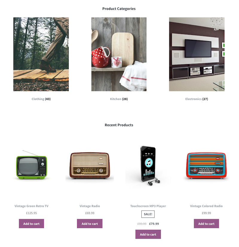
Storefront is free, and there are also 13 extensions (some free and some paid) to add functionality. Extensions make it easier to do things like customize the checkout experience, or add a parallax, hero image to the homepage.
Then there are the child themes. I’m partial to Pro Shop ($39.00) because of the hefty image sizes available, and because the homepage images are a bit unusual, and therefore eye-catching. See how they’re not vertical? That helps your readers’ eye to rest on them longer.
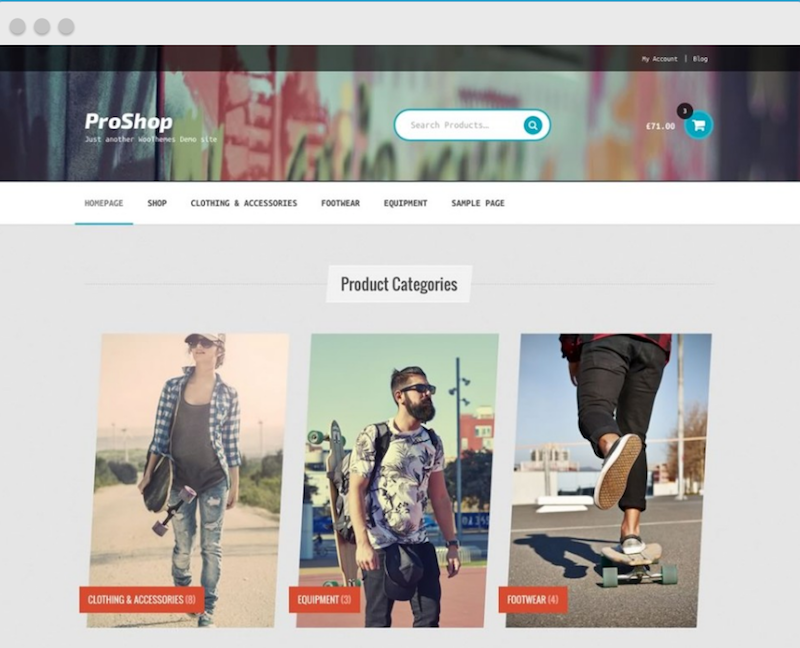
As with any child theme, you must first install the framework (in this case, Storefront) before it will work.
Scrolling and Single-Page Themes
These are extremely popular. In a true single-page theme, clicking a link in the navigation bar at the top sends you directly to the correct spot on the same page.
Some scrolling pages include a parallax feature. “Parallax scrolling” refers to an effect that Wikipedia defines as:
. . . a technique in computer graphics and web design, where background images move by the camera slower than foreground images, creating an illusion of depth in a 2D scene and adding to the immersion.
Altitude Pro from StudioPress is my pick for scrolling homepages. You create the homepage design using widgets.
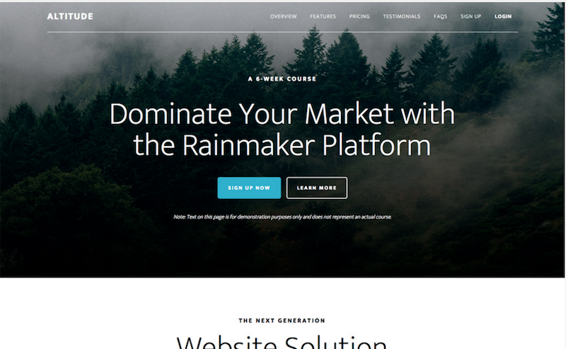
The Altitude Pro homepage includes up to seven widgetized areas, with an almost limitless number of ways to configure them. The layout inside each widgetized area changes, depending on how many widgets are used. Here are some examples.
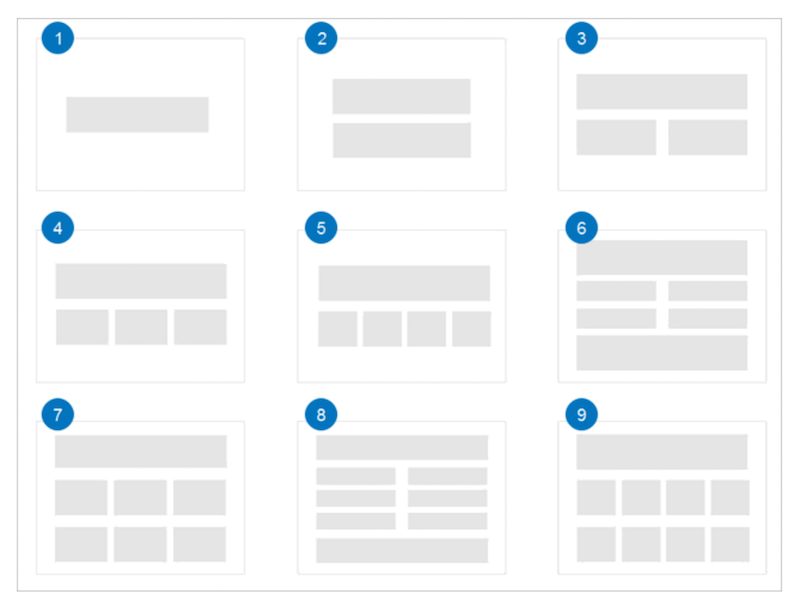
Altitude Pro is a child theme that uses the Genesis Framework — $99.95 for both the framework and child theme. If you already own the framework, you can use it on an unlimited number of sites so the theme alone is $44.95 — less if you’re a returning customer.
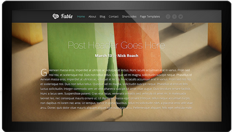
Fable from Elegant Themes offers another impressive scrolling homepage. It tells your story beautifully, showcasing images, video, audio, slides, and text. Elegant Themes works on a subscription model — $69 annually gives you access to all of their themes, support and updates. Add $20 to access their plugins as well, or, if you plan to build lots of sites, spring for the Developer price of $249 one time.
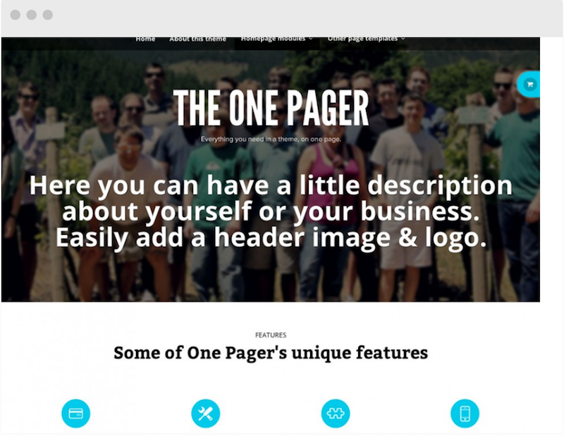
The One Pager from Woo Themes is another excellent choice for a scrolling homepage. It offers plenty of customizations. For $59.00, you get to use it on as many sites as you want, with support and updates for a year.
Portfolio Themes
To be considered a portfolio theme, it must showcase images beautifully, and give you a way to easily create galleries of images. It’s in demand by photographers and other visual artists.
Elegant Themes’ offerings shine in this category.
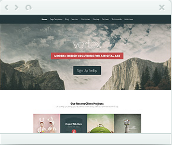
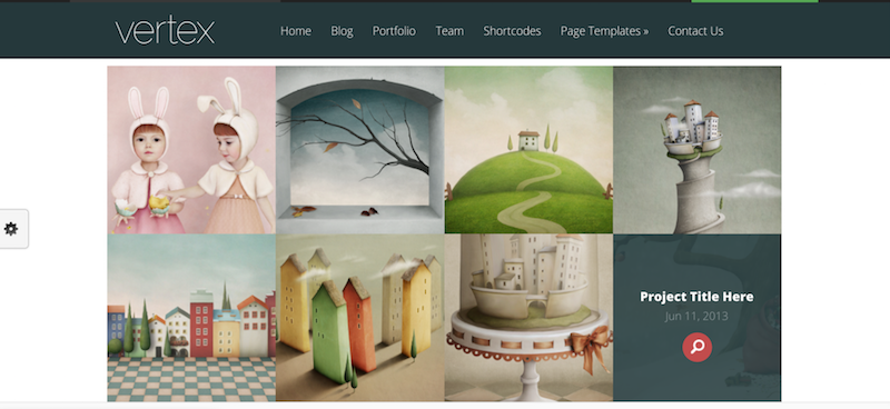
Vertex combines a scrolling front page with gorgeous image handling. I especially like the image grid below.
Blog-Style Themes
Want a more traditional blog setup, but with a businesslike look and feel?
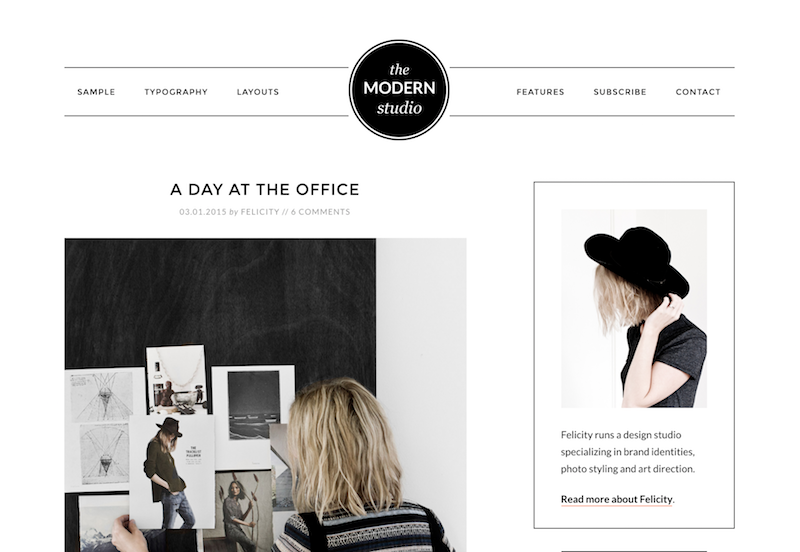
Modern Studio Pro, from StudioPress, is an excellent choice. It emphasizes images, and includes interesting details like the round, centered logo image. Despite a contemporary look, it’s still very much a blog-style theme.
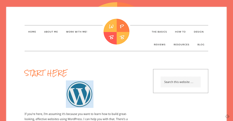
Don’t like the monochrome look? Make it pop with color, like this. . .
For a Solopreneur or Agency
There are dozens of top-notch candidates, but my current favorite for solopreneurs is Workstation Pro from StudioPress.
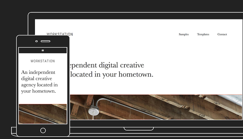
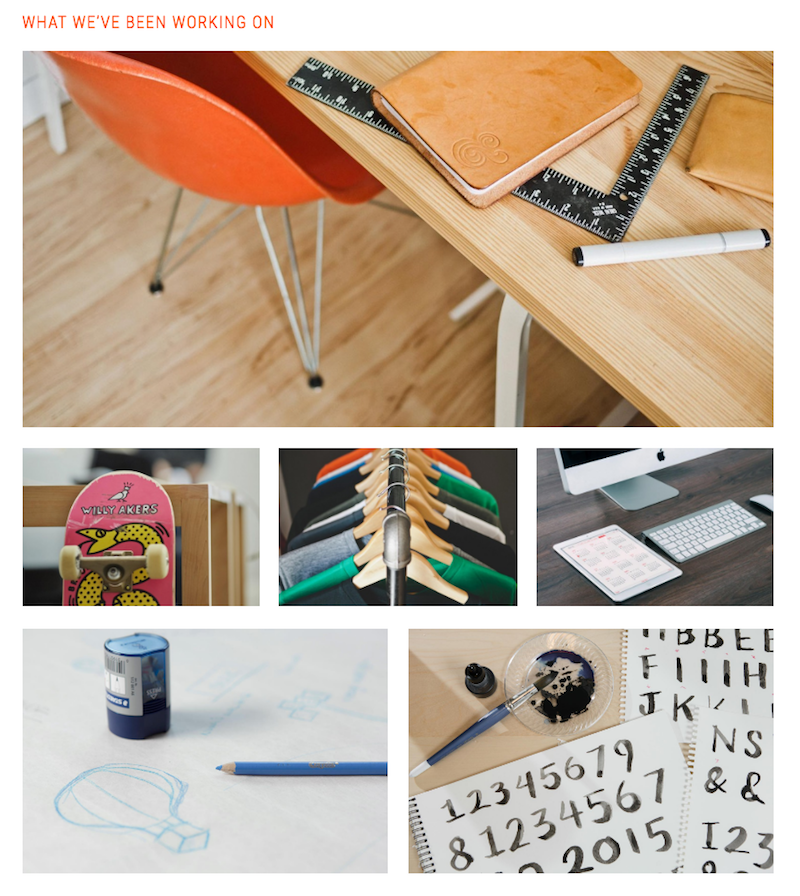
It’s got a versatile front page that uses up to four widgetized areas. Depending on how you arrange the widgets, your homepage options are practically limitless. For example, this cluster of images represents six Featured Pages inside one widgetized area.
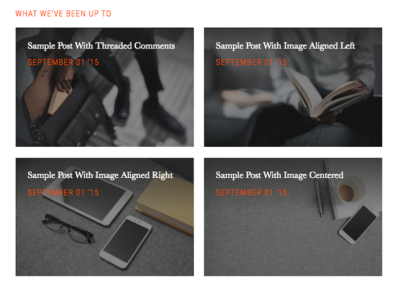
Arrange the widgets a little differently, and you get this:
Minimalist
The clear winner here is No Sidebar Pro from StudioPress. As its name implies, there aren’t any sidebars. Just gorgeous, full-width pages throughout.
This doesn’t work for a lot of businesses, but if you like the zen-like look and your business is no frills, this is the theme to look at.
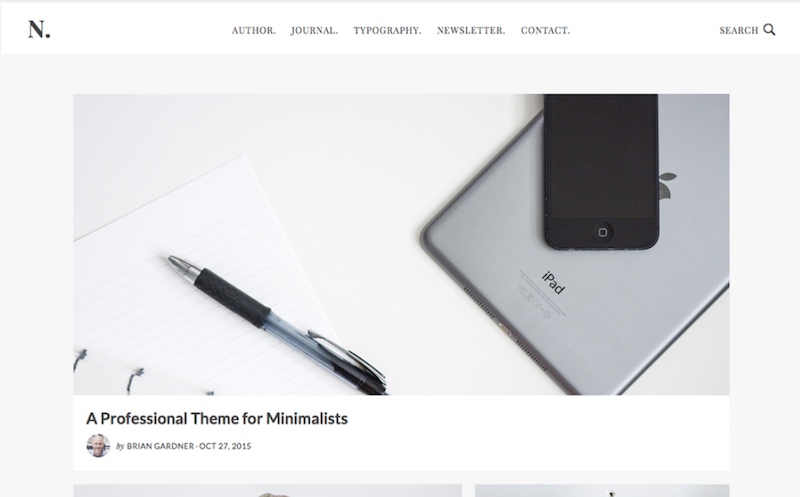
Like many other current themes, images take center stage. This is what the rest of the homepage looks like.
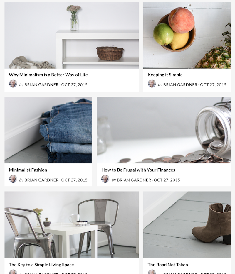
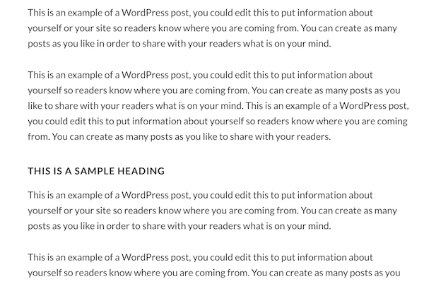
Click on one of these links, and you’ll see No Sidebar Pro handles text equally elegantly — StudioPress does a great job with typography.
Magazine Themes
You don’t have to run a magazine to use a magazine-style theme effectively. Magazine themes are the appropriate choice when your site includes several major topic areas. Those could be “Fashion,” “Hair,” “Makeup,” and “Accessories,” or they could be “Walt Disney World,” “Disneyland,” “Disneyland Paris,” and “Tokyo Disney.”
A magazine theme lets you showcase the most important story or stories, while organizing all the others in logical groups.
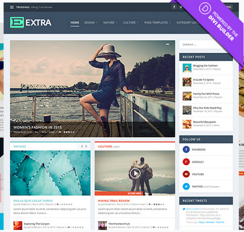
Elegant Themes has a couple of magazine themes jockeying for a top recommendation — Extra and Nexus.
Extra includes a reviews system, and is WooCommerce ready. You can customize almost anything, without using code. That’s because it uses the Divi Builder, a flexible and comprehensive page building system (more on that later).
Nexus uses the traditional WordPress page and post editor, and also includes custom widgets and content modules to help you lay out your homepage exactly the way you want it. Included are several ad-ready areas, making it easy to display your ads and improve your monetization.
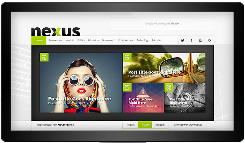
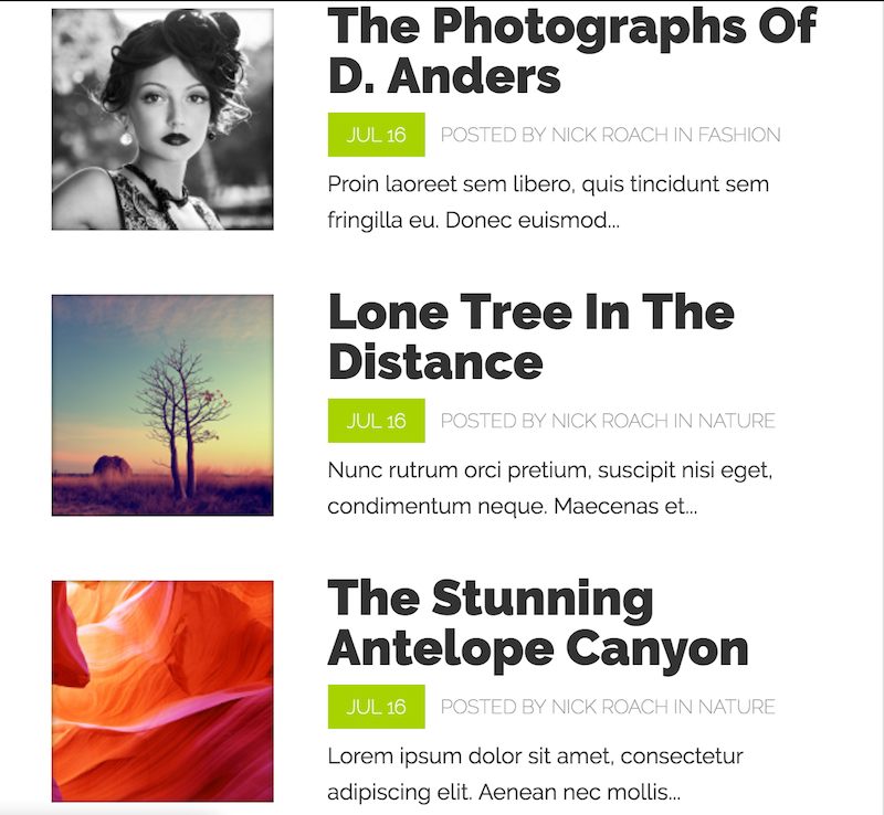
While it will showcase your images beautifully, they’re not the sole focus as they are in themes like No Sidebar Pro and Workstation Pro.
Specialized Themes
Some types of businesses really need themes designed specifically for them — real estate agents, for example.
Here a specialized theme that’s perfect for one type of solopreneur: Author Pro.
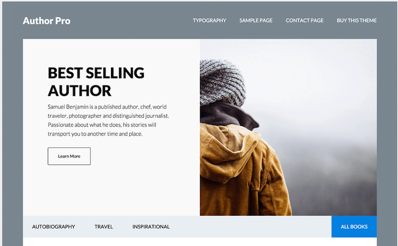
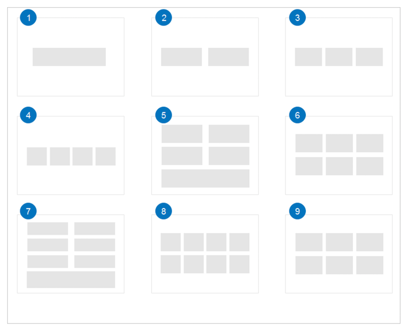
Use up to five widgetized areas on the homepage to tell your story the way you want. As with Altitude Pro and Workspace Pro, you can combine widgets on the homepage for lots of different looks. Here are some of the widget configurations available.
Create libraries with an assist from the Genesis Author Pro plugin (free download from WordPress.org). The plugin creates a custom post type to handle book information like ISBN, publisher, and publication date.
Best Theme Overall
One theme rules them all. Use it to create virtually any style, including:
- Magazine
- Scrolling
- Parallax
- Corporate
- Portfolio
- Solopreneur
- Agency
You could use it for a basic blog as well, although it would be like using a Howitzer to kill a gnat.
I’m talking about Divi, from Elegant Themes.
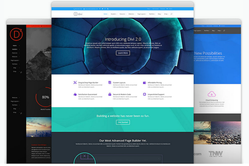
Technically, it’s not a new theme as it was released in 2013. But it’s added so many upgrades and new modules, it’s really brand new. (And they’re upgrading to version 3.0 very soon.)
Divi uses a page builder (remember, I mentioned it in reference to the Extra theme above). With the page builder, you can customize any page on the site, not just the homepage. If you’re not sure how to do that, Divi arrives with 18 premade page designs — make your selection with the click of a button.
At your fingertips, you have:
- 46 content modules
- Advanced design settings for each module
- Custom CSS for each module (if you like using code)
- Multiple layout options
Change fonts, colors, adjust type styles and sizes easily. Use different sidebars on different pages. Use one hero header image on the homepage, and a different one on another page. You’re limited only by your imagination.
Now, a word of caution: if you’re new to WordPress, you might find the Divi learning curve a bit steep. If that’s the case, I’d suggest familiarizing yourself first with something more basic, like the TwentySixteen theme that comes preinstalled with WordPress. Use it to learn how to place a header image or a widget. When you’re comfortable with that, switch over to Divi and it’ll make a lot more intuitive sense to you.
As if Divi weren’t already great enough, right now there’s a special event happening at Elegant Themes. They’re calling it the Divi 100 Marathon, and they’re giving away all sorts of free stuff, like a Testimonials Layout Kit and a free Photo Gallery Layout Pack. On the last day, they’ll release Divi 3.0… and I can’t wait.
For more awesome advice on how to build a business with WordPress, join the SiteSell community of solopreneurs today.
Latest posts by Susanna Perkins (see all)
- How To Review, Reinvent And Revitalize Your Growing Solopreneur Business - September 8, 2016
- 6 Tools to Help You Corner Your Share of a $107 Billion Industry - July 11, 2016
- WordPress – Not Just for Bloggers Any More - July 6, 2016

