Understanding and implementing the concept of a Most Wanted Response (MWR) is critical for generating a good income online. Even though it’s a simple concept, many fail to apply it when they reach the monetization stage.
This article will guide you through learning about the Most Wanted Response, deciding on what it should be for each page of your site, the options for applying it to a page, and tips for implementing it.
- What Is a Most Wanted Response?
- Why Have a Most Wanted Response?
- How Do You Pick the Best MWR for a Specific Page?
- What Are the Ways to Get Your MWR?
- Are You Getting the Best Results With Your MWR?
What Is a Most Wanted Response?
Your MWR is the action you want your visitors to take on a specific page of your site.
If you think about it, you’ll come to the conclusion that your MWR is to get the click. The question is, what does “the click” mean? What the page is about … what it’s for … determines what “the click” means.
On a landing page, your most wanted response could be to have a form completed, to get the visitor to click on an affiliate link, to buy your own product, or simply to visit another page on your site. But it all starts with “the click!”
Why Have a Most Wanted Response?
Without a clear MWR, your visitors are much less likely to take the primary action you want. They will likely take one of two actions:
- They’ll leave your site (the worst case scenario, and the one that every visitor reaches eventually), or
- They’ll travel endlessly around your site, reading your information, but never helping you earn money (the best case scenario).
How Do You Pick the Best MWR for a Specific Page?
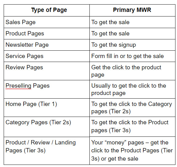
Before you can ask, you need to decide what your MWR for a given page will be. Here are a few suggestions …
Sometimes it’s OK to have a different MWR for a given page type. Some Tier 2s might be product or sales pages, so the MWR would be to get the sale, not to get them going deeper into your site to the Tier 3s.
Limit MWRs to two per page for any page on your site. Why? If you give too many choices, visitors will have a harder time choosing which way to go. If this happens, they’ll likely leave your site, which means you won’t get either MWR.
Your Tier 2 Category pages will usually have more than 2 links to Tier 3 pages, but the MWR is still just one… getting them to a Tier 3 page. The same goes for your home page — its MWR is to get visitors to click to a Tier 2 page.
What Are the Ways to Get Your MWR?
Deciding on an MWR for a page is easy. The real work comes in taking that MWR and making it happen — getting visitors to do what you want, when you want them to do it.
Now let’s discuss how to improve your sales/product pages and PREselling pages so that they get your Most Wanted Response.
Sales Pages
We’ve all seen sales pages for e-books or other e-goods online. Some salesy language, colorful fonts and images, and lots and lots of text.
Sales pages are about selling … telling your visitors why they need what you offer; not just telling them about your product. In other words, explaining benefits, and not just features!
You also need to ask your visitor to buy multiple times, and you can’t be subtle about it.
Don’t be afraid to tell your visitors what your product will do, but especially explain to them what problems it will solve for them. After all, your visitors want to know how you (or your product) can help them.
Talk about your product (its features), but that should be secondary to its benefits — what problems it solves. Show your product too. Use photos and/or graphic representations of your product, and what it does. Even show your visitors the care that went into producing it.
Then give them the confidence to buy (money back guarantee, secure payment processing icon, privacy policy, refund policy, testimonials, trust seals, etc.).
Sometimes providing an icon is sufficient. Other times, you’ll need to have supporting pages linked from the sales page. But, keep the links discreet (at the bottom and/or top of the page) so they don’t distract from the message itself.
Where appropriate, you then need to ask them to buy (and buy now), or fill in a form, or do whatever action you want them to take now (this is what we call a “Call To Action”). For longer sales pages, add multiple Calls To Action (i.e., multiple buy buttons or links spread through the page, or multiple links to a form, etc.), but just one MWR.
Don’t forget the price. Do take it a step further, of course, and show the value for the money. Why is your product better? How is it different, what does it do that the competition can’t?
 Add testimonials above and below the Calls To Action. They help visitors gain confidence in your site and in your product.
Consider the length of the sales page. How much text is too much, how much is too little? Usually the more expensive an item is, the more content (text) you’ll need to persuade prospective buyers they can’t live without your product.
I mentioned before to limit MWRs to 1-2 per page. For sales pages, the MWR is to get the sale, but consider a 2nd MWR to get their email address if they don’t purchase during that visit.
Keep in mind, you don’t want to distract the visitor from your MWR of getting the sale! Consider using exit actions to trigger a signup, offer a discount, etc.
Speaking of distractions … your sales pages should not have distractions such as site navigation, links to other pages (except as noted for supporting pages) or products, or other advertising on them.
Product Pages
Product pages are sales pages, but shorter ones. Since many sites (particularly store-type sites) offer multiple products, having a shorter product page vs. a long sales page is expected.
Even though they may be shorter, they still need a good description of the product, its features, and the benefits it can provide the buyer. They also still need to build confidence in the prospective buyer to make the purchase from or through your site.
Popular stores on the Internet often provide links to a few (just a few) related, popular or similar products several lines below the product image, description and buy button. These links are considered a second MWR for the page.
Asking for a newsletter signup or completion of a survey form on why they didn’t buy could also be considered, but don’t try to do everything. Adding multiple MWRs can irritate your visitors, which may keep them from coming back. Keep everything primarily focused on your single Most Wanted Response.
When you have multiple products, such as in a store, you can have a side menu for other product categories, as well as top and / or bottom links to supporting informational pages for shipping, returns, FAQs, etc. People also like to see what others liked, ordered, reviewed from your store.
On your product page, include multiple photos of the product, good descriptive text, etc. Shorter than a sales page by far, but the basic elements remain the same:
- Enticing Title
- Description
- Benefits
- Features
- Testimonials /Reviews, etc.
And, don’t forget…
Provide the buy button or link close to where you ask, or as part of the Call To Action.
Preselling Pages
Just as your sales page has a job to do (to sell), so do your PREselling pages. But don’t confuse the two. Never hard sell on a PREselling page. Instead:
- Reduce distractions.
- Go from presell to soft sell.
- Make the connection.
- Make the recommendation.
- Ask for “the click” (Call to Action).
Your PREselling pages can each have 2 MWRs. Getting the visitor to go where or do what you want is primary; secondary could be, for example, links to other pages or products on your site, or a newsletter signup.
In fact, I recommend you keep the links to the other pages you want to recommend lower on the page (actually last on the page) after your soft sell. This way the focus is on the soft sell to the product you want to promote (your MWR), then if they choose not to click, the next item they see are the links to the other recommended pages or products.
If your MWR for a page is to get visitors to go to another page on your site (e.g., your Tier 2 Category pages linking to Tier 3 content pages), that’s ok, but if it isn’t your primary MWR, don’t link from one page to another. You’ll encourage your visitors to read and read and read, and never give you the sale.
 So, remember not to distract your visitors by lots of links to other pages (unless that’s the MWR for that page). Guide them to your MWR by focusing the content on the primary MWR, then your secondary one, in the flow of the page.
From Presell to Soft Sell
Your PREselling pages, or great informational content pages, were first written to inform, to over-deliver on great content. When you did that, your MWR was likely to link to other pages of your site. But now you’re monetizing. Your goal is to get them to buy products or services. So what do you do now?
You have 3 options. You can edit the pages just a bit to work in your sales MWR, or add a paragraph or two to soft sell your new MWR of clicking to a sales or product page, or both!
- Edit the text, removing links to other pages on your site that are within the flow of the content. If you still want or need to link to other pages, put a list of those links at the bottom of the page instead (except on the home page, where the MWR is to get visitors deeper into your site).
- Add a product/service image and link it to the sales / product page. Add a soft sell caption to the image.
- Add a link or two within the text to the product / sales page.
Add a soft sell paragraph or two:
- Add a paragraph or two near the end that soft sells the product/service with a link to the sales/product page. Ask for the click!
- Add the product/service image as noted above so it’s part of the soft sell section too.
I recommend you do both, editing and adding the soft sell at the end of the page content (before the list of links to other pages), but test and track to see what works best for your pages.
When Do You Want a Soft Sell and Not a Hard Sell?
The words you use to ask, and their placement, can go a long way toward getting the result you want. It’s important that the product / service you want to promote is relevant to the linking page’s topic, and is what the visitor needs and is looking for. If it isn’t, you’re much less likely to get the click and the resulting sale.
For example, one client asked me why she wasn’t getting any sales for a particular product she was recommending for acne. She did a decent soft sell and linked to the product page. But she never mentioned the product by name.
The merchant’s landing page showed the name of the product (and its description) but never mentioned how the product helped with acne. There was no connection between the recommendation and what the landing page showed, so visitors may have thought they were on the wrong product page.
Another client had a site on managing stress. Quite often she put in one strong sentence about massage chairs, and would link to the product page at a furniture store for massage chairs (landing page).
While massage chairs are great at helping to reduce stress, they are big ticket items. She didn’t make the connection between reducing stress and using massage chairs. In other words, she didn’t presell massage chairs as a way of managing stress. She just used a short blurb to link to the landing page on a variety of pages about stress, stress and disease, etc.
If the PREselling page doesn’t connect the product with your landing page, then you aren’t going to get the sale. So make sure the connection is there, or include it in a soft sell at the end of the page.
Also, big ticket items need more PREselling than small ticket items. You need to make the connection and help build confidence in the product much more with big ticket items.
Consider using review pages as a way of doing this, but always make the connection between your page and the product on the landing page, especially if the merchant doesn’t.
Small ticket items are easier to connect, and are often “connected” by the merchant on their product page. For example, if you have a skin care site, and a PREselling page about pimples, you’ll link to products that prevent pimples, or reduce their appearance on your visitor’s face. So linking within the flow of the content is a natural.
However, if the landing page doesn’t mention pimples, or how the product works to help remove, reduce, or hide pimples, then the connection isn’t there. You’ll need to make it for the visitor. This means a simple link to the product, within the content, likely won’t get you the sale.
In a soft sell paragraph, go one step further. Mention why you’re recommending this specific product / service as well as how it connects to the problem the visitor wants to solve. (Have you used it? Do you have testimonials to show how well the product works?) If you do that, ask for the click by providing a clear Call To Action.
Stay away from the hard sell on PREselling pages. A hard sell might include heavy formatting such as all capitals (it’s considered screaming/yelling on the Internet); formatting soft sell content so it stands out (color, fonts, bold, italics, well-placed exclamation points, etc.).
Words that imply making a demand are also not a good way to get your visitor to do what you want. Your soft sell should flow with your content and lead your visitors, not drag or push them.
Asking for “The Click” (aka A Call To Action)
Asking your visitor to take a specific action is hard to do for a lot of people. If you’re one of them, you’ll have to get over it! Think about how you would like to be asked to do something, and then use that to write your own call to action to get your visitors where you want them to go.
- Reduce distractions.
- Go from presell to soft sell.
- Make the connection (if the landing page doesn’t).
- Make the recommendation.
- Ask for “the click” (give a clear Call To Action).
Remember…sales and product pages are for selling; PREselling pages are for PREselling and can include a soft sell. While you may need to do a bit extra at times when the merchant’s landing page doesn’t do its job, never hard sell on a PREselling page.
If you’re offering your own products / services, including a newsletter or e-course (even if it’s free), you need a dedicated sales page. But don’t “sell” your own products / services on PREselling pages. You soft sell and link to your dedicated sales or product page.
This goes for merchants whose products you promote also. Let the merchant’s product landing page do its job. And when it doesn’t, consider what extra steps you need to take to complete the process.
What are those extra steps you may need to take? One is to make the connection discussed previously; another is to do a slightly stronger soft sell that includes not only your recommendation, but also a bit more about the product and what it does to solve the visitor’s problem.
What If You Can’t Ask for the Click?
I mentioned using other ways to get the click. For instance, with Adsense ads, you cannot ask for the click. Ad size, placement in the page, colors, etc. all play an important part in improving conversions. However, you also have to pay special attention to what the advertiser will and will not allow. Know the rules, then test results with small changes.
Are You Getting the Best Results With Your MWR?
If you’re happy with the results, and income, you’re getting, you can skip this section. But I recommend you keep reading!
As with any monetization strategy you implement, tracking and testing are essential. Otherwise you won’t know what change to your site, let alone a single page page, caused changes in your MWR conversions or your income. And when you want to maximize conversions and income, track and test, make additional changes as needed, then track and test again.
What Should You Change and Test?
Everything! But one thing at a time. Here’s a list of some of the page elements to consider testing:
- Title (in the source code’s “Head” section); this appears as the clickable link in the search engine results, so you need to grab the attention of the right visitors (your target market) and get them to click on your link. This is usually the first thing your visitor sees before coming to your site.
- Headline (likely the first thing they see on your page)
- First paragraph
- Benefits (come first and last in the page)
- Features (come later in the page)
- Calls To Action (including buy buttons)
- Images/Photos (must be high quality)
- Link Text (aka anchor text)
- And the list goes on. Test everything if you can.
How Many Visitors Should See the Page to Consider It a Good Test?
Whether you do it by organic search results, your newsletter subscribers, paid traffic, etc., try to get 1000 unique visitors to see the change before you draw any conclusions from the test.
Why 1000? It’s statistically considered a large enough number to reduce the effect of bias in the test.
- Track the changes you make
- If you don’t track, you don’t know
- Analyze the results
- Did they improve conversions and/or income?
- Make a decision … What’s the next step?
- Improved results? Keep the change.
- Disappointing results? Revert back, try something else.
- Rinse and repeat.
 To obtain the maximum number of conversions on your site, don’t just test your product or PREselling page. Take it a step further and consider changes to the landing page.
If you don’t control the landing page, consider changing products / merchants and tracking that too. You may find another product / merchant will give you a better conversion, and that’s worth testing!
When It Comes to Your MWR, Here’s the Bottom Line
- Determine what your MWR will be on a page by page basis.
- Use “Best Practices” to start (see what other top pages are doing and use them for inspiration).
- Make one change at a time.
- Test (1000 unique visitors need to see the change).
- Track.
- Analyze.
- Rinse and Repeat.
After all, the goal — your Most Wanted Response — is to “Get the Click!”
Download the How To Improve Conversions Cheat Sheet or sign up below to receive a link via email!


Latest posts by Debs Seeber (see all)
- 15 Call to Action Examples That Are Proven To Work - January 22, 2021
- 8 Call to Action Examples to Fire Up Your Marketing - June 9, 2020
- 7 Strategic Ad and CTA Placements for Maximum Impact - May 26, 2020

