Your website design influences reader behavior more than you might think. If you’re not happy with the results you’re seeing, create a plan to change your site design to increase website engagement and conversions.
This is easy to do when you’re running on WordPress — a new theme and you’ve got a new-looking site. But “new” isn’t the goal. Instead, you want to attract more targeted traffic, engage them with your content, and convert them to take the action you want them to take.
Unless you’re running the site simply as a hobby, in which case you can stop reading right now.
If you’re running a business, the first change to make is inside your own head. Take a look at your site — or, even better, ask some trusted friends to look at your site — with objective eyes. What do you see?
Your site should look clean and uncluttered, and should naturally and easily draw the visitor’s eyes toward the most important action you want her to take. That could be clicking a link, opting in to receive your newsletter or a free download, requesting a consultation, or reading your latest blog post.
If there’s too much happening on the page, the reader doesn’t know where to look next, so his eyes jump around all over the page and he’s likely to leave your site.
When faced with too many choices, the average person chooses nothing.
Kissmetrics published an article about the psychological principles behind a website that converts well. They outlined four laws:
- The law of “pithiness” – pages convert better when you minimize reader choices, remove unnecessary elements, and find one focal point.
- The law of past experience – what a reader experienced in the past will influence the way he interprets a present experience. In other words, if a reader is used to looking for an “About” page to find information about the company or blogger, give him an “About” page, not a “My Soul Journey” page. This is not the place to be cute or clever.
- Principle of cost-benefit analysis – you want to decrease obstacles and increase the incentive for the reader to take the action you want him to take on that page.
- Fitt’s Law – the time required for a reader to move his mouse to the target is a function of the distance to the target and the size of the target. You want to bring the target (a “Buy Now” button, for example) closer, and make it bigger.
In this post, we’re going to talk about the homepage, landing page and blog page. Each has a different purpose, and meets different needs for the site visitor. Therefore, each needs to be set up a little differently.
The Homepage
Not every first-time visitor lands first on your homepage, but you should design it as carefully and thoughtfully as if that were the case. You want to get the reader’s attention right away, and then lead him to take the most desired action.
The desired action isn’t the same for every site, or even for every page within a site. It will vary depending on your niche or industry, and what you’re offering. Frequently, though, the most desireable action for a new visitor is to opt in to your email list. If that’s true for you, make your opt-in form easy to find, and easy to complete.
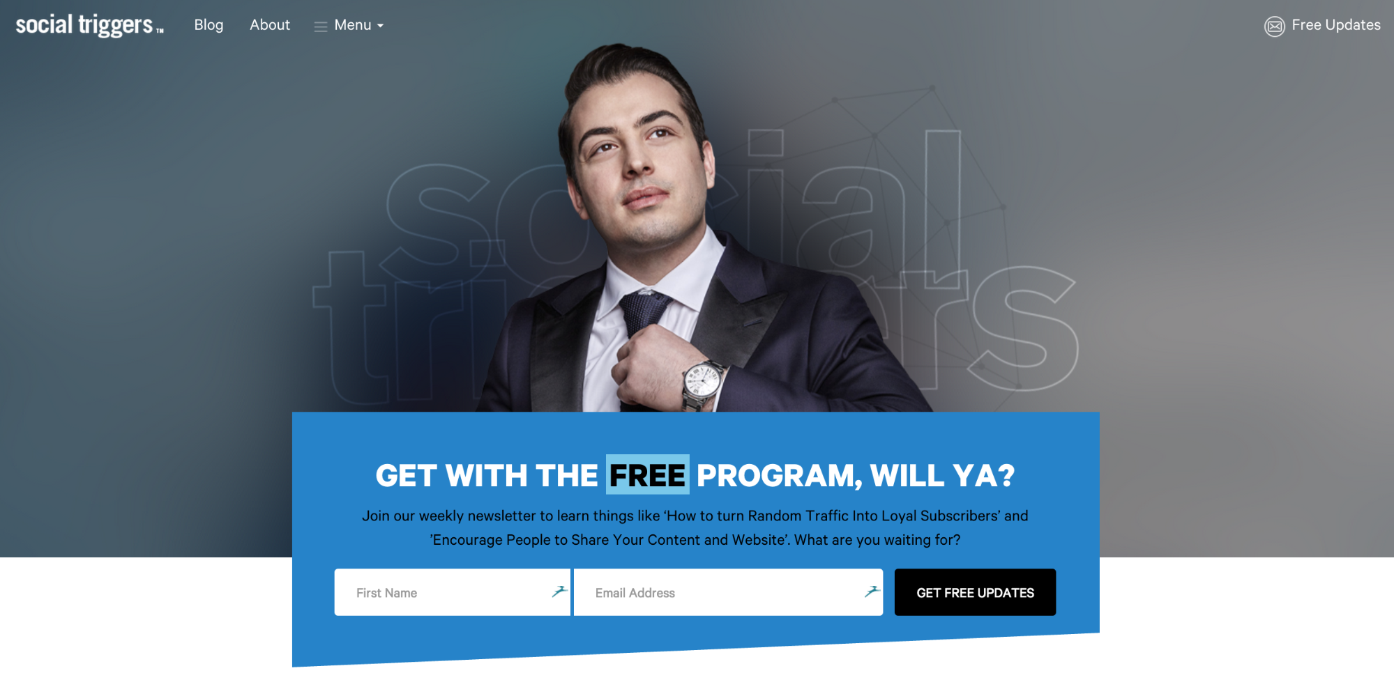
Derek Halpern of Social Triggers does a great job of this on his homepage.
Just below his “hero image” photo is a large, blue, irregularly shaped box where you can fill in your first name and email address. He invites you to “Get with the Free Program, Will Ya?”, then offers a couple of benefits.
He doesn’t ask for a lot of information, which reduces the barriers (or friction) to getting signups.
Below that, he offers three different sets of free information, which all feed into his sales funnel.
Continue scrolling, and you arrive at recent blog posts, then some credibility-builders, and then another opt-in form at the bottom of the page.
None of this is accidental. Derek’s business is all about studying why people behave as they do online, and how you can maximize results from your online business. So you can bet he’s studied and tested — a lot — before making these changes.
Most of us have a tendency to want to put everything but the kitchen sink on the homepage. Resist that impulse! Marketing Land tells us:
“The fastest way to make a website worse is to add more stuff.”
They point out that, with every element you add to a page, you lower the value of all the elements on the page. For best conversion, you want your homepage to offer few choices and minimal distractions.
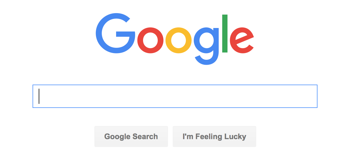
Think about one of the most-viewed homepages on the internet. It sports a bright, three-color logo, and a box you can type words into. Below that are two buttons.
Do you think anyone ever has a question about what to do here?
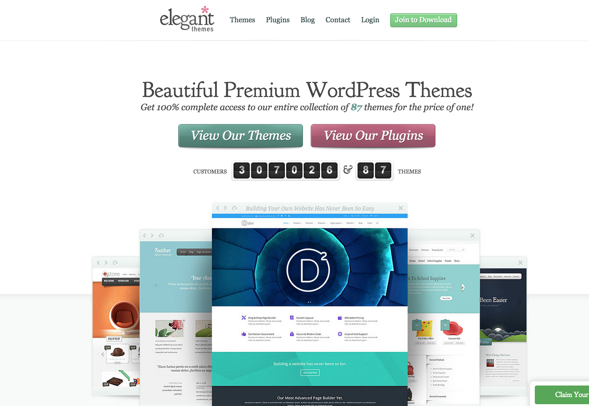
Here’s the homepage for Elegant Themes.
They display several of their best-selling WordPress themes and offer a simple choice between two options — View Our Themes, or View Our Plugins. In case you’re not sure they’re worth checking out, there’s the counter which demonstrates social proof — over 300,000 customers, 87 themes.
It’s simple and elegant.
Landing Page
There are several different types of landing pages. One type of landing page can look a lot like your homepage or another page on your site, but with a few subtle differences. For example, some bloggers have different pages and unique links to identify visitors who come from Twitter, or Facebook, or another social platform. If you’ve written a guest post on a better-known blog, you might want to create a special landing page for traffic from that site.
In terms of design, this type of landing page will look just like the other pages on your site, but the content will change.
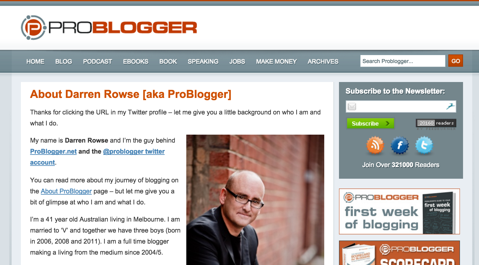
Here’s an example: Darren Rowse, founder of ProBlogger, has a special landing page if you’ve followed his Twitter link.
In case you can’t read the first paragraph, it says:
“Thanks for clicking the URL in my Twitter profile – let me give you a little background on who I am and what I do.”
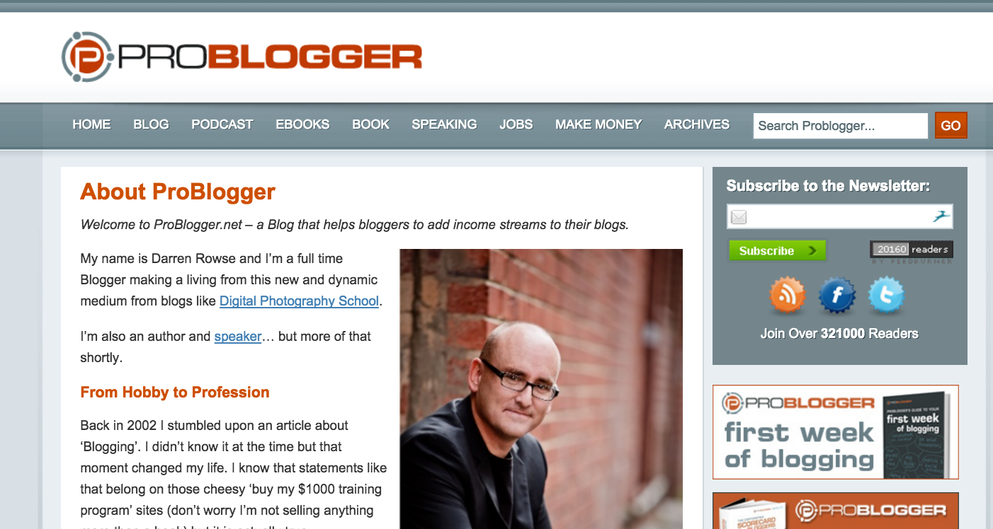
However, if you were to click the About link within the website, you’ll find a slightly different page:
The first is targeted to people who find him through Twitter and want to know more about Darren personally. The second is more about ProBlogger, and how Darren can teach you to become a full-time blogger like him.
(Notice on both pages, though, the opt-in box is at the top of the sidebar, and the “ads” you see on the right are ads for his own products. More on that later.)
A sales page and a squeeze page are different. Normally, a squeeze page collects information, such as an opt-in to a newsletter. A sales page, obviously, is there to turn the reader into a customer.
On these pages, you want to offer the visitor one choice and once choice only: to sign up for your list, or to purchase what you’re selling. You don’t want your usual sidebar, or navigation. You just want your company logo at the top, and the message and call to action. No navigation, no distractions.
Fortunately, most WordPress themes make it very easy to create landing pages with a special template. Your theme might call it “full width,” or even label it as a “landing page” template.
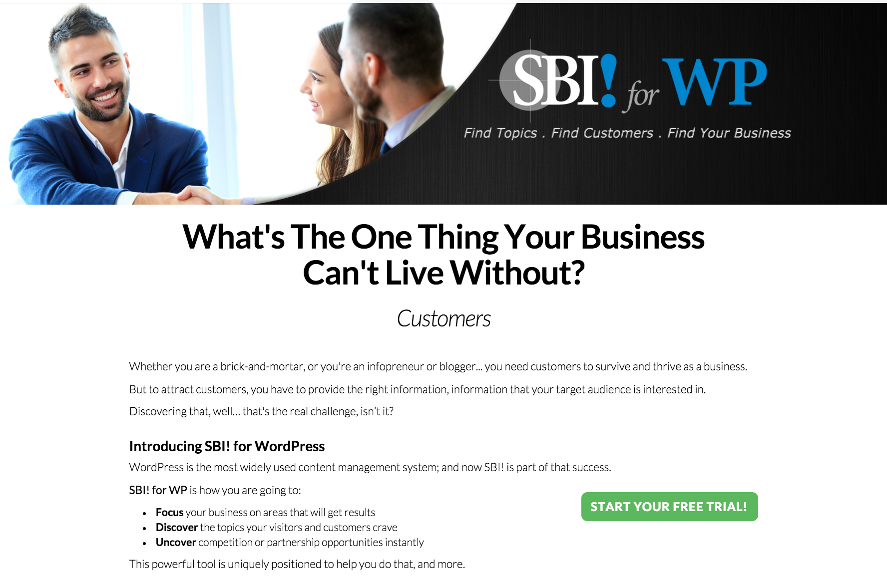
Here’s the SBI! for WP sales page.
The header shows you what it’s all about, the text introduces the biggest challenge (finding customers), and offers the chance to start your free trial right away.
If that’s not enough information, you can continue scrolling for more information, with additional action buttons in appropriate spots.
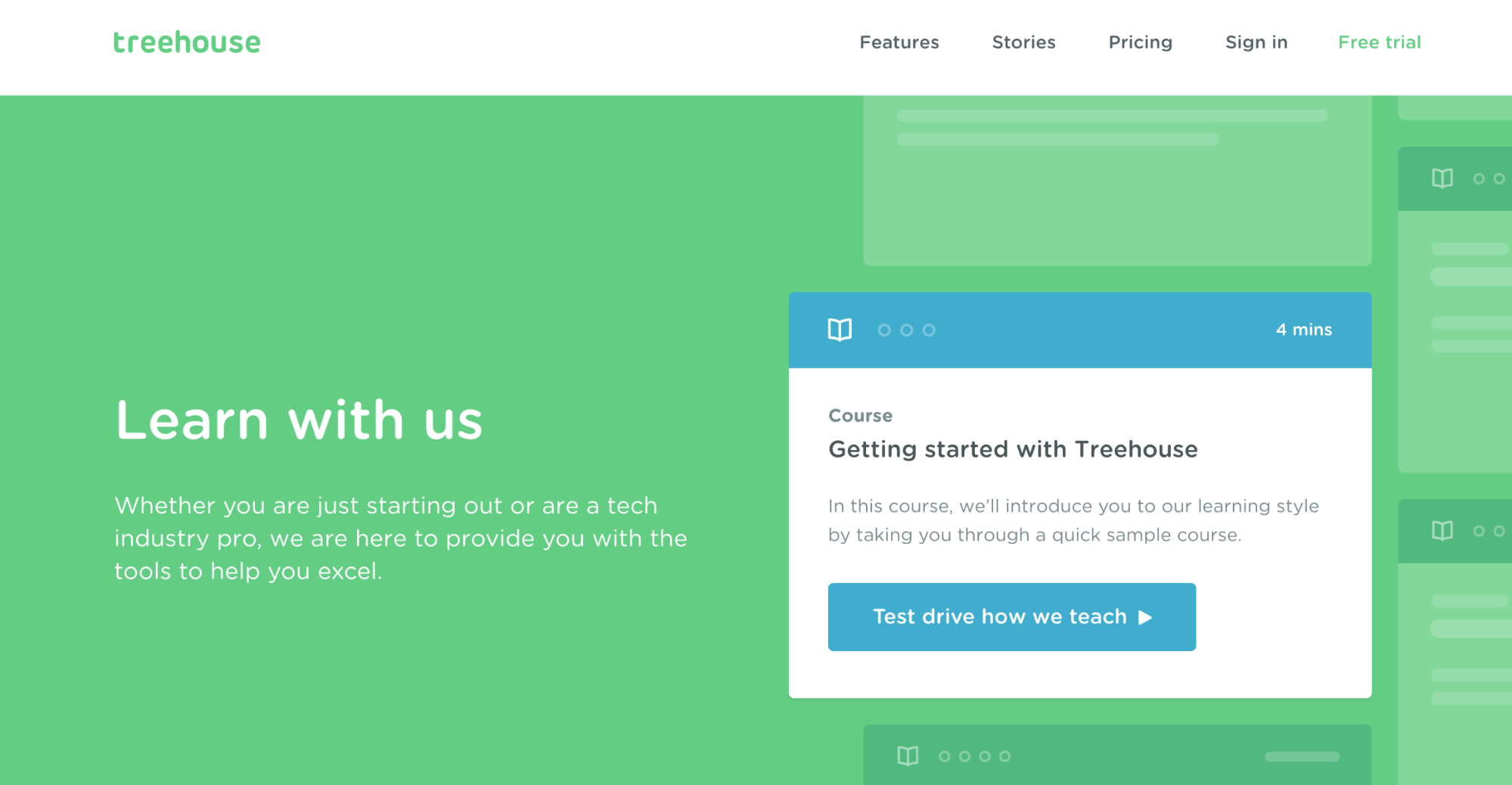
Or how about Team Treehouse, which teaches technical courses?
This is brilliant, because the introduction to their learning environment is a walkthrough of the learning environment — and it is the only action you can take on the homepage, other than going up to the navigation menu at the top.
Blog Page
Let’s look at the blog page. I’m talking here about both the single-post page and the page that includes the excerpts from all your posts in reverse chronological order. The header, sidebar and footer areas should look the same for both.
If your entire site is a blog, consider how you can maximize the homepage aspects.
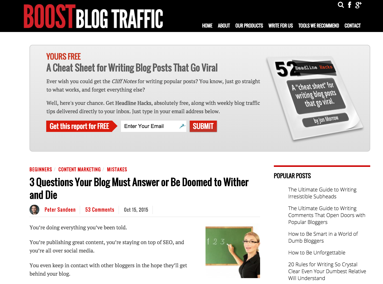
Take a look at what uber-blogger Jon Morrow did with his Boost Blog Traffic blog.
It’s not fancy, but it’s effective. Notice the full-width opt-in at the top of the page, just below the header. On the sidebar he includes a list of Popular Posts, and below that, a list of categories that yields collections of posts from 26 well thought-out categories.
It’s likely your visitor reaches a single-post page because she’s clicked on a link in search, social media or in an email. If the link promises “3 Easy Green Smoothie Recipes,” and instead your post presents 1 green smoothie recipe, a recipe for pumpkin pie, and a recipe for a chai tea latte, your reader will feel cheated no matter how delicious they are. Make sure you give her what she’s expecting. (That’s important for search ranking as well!)
Then, give her more to look at so if she likes what she sees, she can easily find similar posts. Offer a link to click to see more green smoothie recipes. Include links to some favorite recipes for other foods or beverages. Show her the most popular posts. You want her to spend time on the site.
In addition to providing easy ways to find more articles of interest, include an opt-in form. It’s normal to find it at the top of the sidebar — but test other choices as well. Lots of bloggers find that including the opt-in form at the end of the article is a good strategy. After all, if she’s read that far, she’s probably liking what she’s reading. Some, as you saw in the example above, put it right at the top of every page.
It’s pretty standard to also include two types of social media buttons. One set, usually found in the sidebar or footer, invites the reader to follow you. If you’re using this strategy, show icons only for the platforms where you’re the most active.
The other set of social media icons invites the reader to share that post. They can float to the side, above, or below the post, or you can use stationary icons above or below the post.
There are many more elements you can add to your sidebars or footers, but before allocating that space, ask yourself some hard questions:
- Does it encourage the reader to take the most desired action?
- Does it lead the reader to the next step toward the most desired action?
- Does it improve the site’s credibility?
- Does it add to the know, like, and trust factor that makes people want to do business with you?
If you can’t answer “yes” to at least one of those questions, leave it out.
Finally, whenever you make changes, test those changes to measure the results. When you find something that improves your conversions or attracts more targeted traffic, think about how to make it even better.
For more informative articles such as this sign up for are newsletter.
Latest posts by Susanna Perkins (see all)
- How To Review, Reinvent And Revitalize Your Growing Solopreneur Business - September 8, 2016
- 6 Tools to Help You Corner Your Share of a $107 Billion Industry - July 11, 2016
- WordPress – Not Just for Bloggers Any More - July 6, 2016

